• HOME
  • Portfolio
  • Shop
  • Learn
  • About
  • Cookbooks
  • Blog
  • Search

Lori Rice

Photography | Styling

  • HOME
  • Portfolio
  • Shop
  • Learn
  • About
  • Cookbooks
  • Blog
  • Search

Flat Lay Photography: A guide to styling from minimal to cluttercore

Some say flat lays are over, but here’s the truth: flat lay photography hasn’t gone anywhere—it’s just evolved. And when done well, it still communicates a message to the viewer in an inspiring, informative way.

A flat lay gives you the opportunity to tell a story in one single frame. They are great for product highlights, ingredients, tools, seasonal themes, color stories, and styled kits.

They are highly shareable whether on social media, on your website or portfolio, and in e-commerce stores. They are still used in everything from print layouts and ebooks, digital products, and branding imagery. They make what you are trying to communicate or sell easy to understand. 

Just this spring, I photographed an advertorial for EdibleSLO that ran in their spring issue to share about local products for Easter baskets and spring gifts.

Flat lays are applicable to nearly everyone. Here are some ways they work for photog-stylists, small business owners, bloggers, and content creators.

  • Food & Ingredients – shopping lists, recipe breakdowns.

  • Products & Packaging – skincare, jewelry, paper goods, you name it.

  • Travel and Shopping Stories – maps, postcards, tickets, journals. Souvenirs you picked up, thrifting shopping finds.

  • Creative Lifestyle – art tools, outfits, accessories, moodboards.

  • Small Biz Scenes – flat lays of your process, materials, or kits.

  • Education - all the varieties that exist (my favorite when it comes to produce, of course!).

These are a few tips to keep in mind when you are styling your shot.

Plan your color palette and choose a direction with color. Go monotone or use complementary color families to create a cohesive look.

Layer by choosing your hero item. Then build from your background to the focal point, your hero. (But you don’t always have to layer. For some flat lays, the hero on the surface works the best.)

Consider the eye path. You are in control of where you want your viewers to look first and where you want their eyes to go. Build that with your composition.

Don’t be afraid of negative space even in busy scenes that embrace cluttercore.

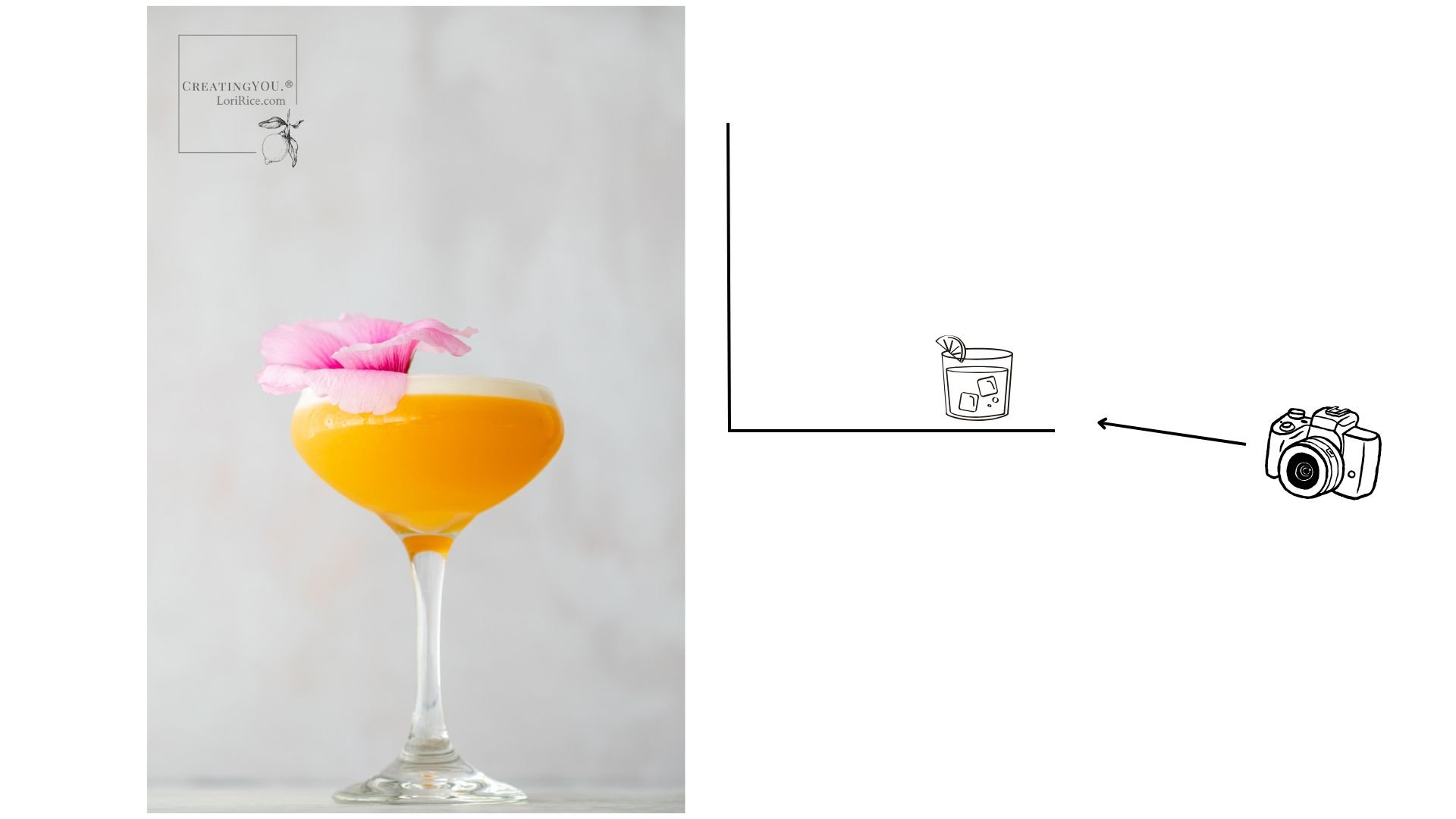
Natural light is your best friend. Use a scrim and white bounce card if necessary to reduce harsh shadows.

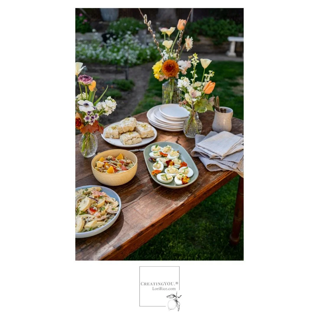
Flat lays can range from minimal to maximal in style. It’s your choice and it may vary by your shoot, the client and product, even your mood or the season. Here are some styles to experiment with. 

Minimal = One or two objects. Lots of space. Feels calm and clean.
Classic = A central focus item + a few accent props.
Story + Education Driven = A curated collection of items that tell a moment in time or educate on a topic.
Cluttercore = a current styling trend that is maximal, visually rich, and busy but balanced. An overflowing harvest table or a plant lover's shelf are good examples.

Experiment with different styles to find which you like best and which works the best with the hero you are photographing.

tags: flat lay, styling, food photography, product photography
categories: Photography Tips, Styling Tips
Tuesday 04.22.25
Posted by Lori Rice
 

Maximalist food styling tips for minimalist photographers

One of the big predictions in art this year, , was a shift to maximalism. Supposedly, it’s in retaliation for all the minimalism with simple designs and neutral colors that grew in popularity over recent years. 

So if bold colors, bright patterns, and over-propping (in a good way) are your thing, it’s your time to shine. 

But what if it’s not your thing? 

As a negative space, neutral-loving stylist-photographer, I feel you. 

There are ways to create more maximalism in your work while still keeping things simple. While, of course, you don’t need to follow trends, sometimes experimenting with them can help you grow. Here are some ideas.


Try simple applications of color. You don’t have to go all out. Incorporating one or two and still keeping the propping simple gives a balance of boldness with minimalism. 

layered chocolate pudding and whipped cream with yellow cake on a maximal bold yellow background
orange mandarins in a teal blue bowl with matching eco-friendly bag and surface

Lower angles can create a towering effect for your subject, giving it a more striking presence. 

bright cocktail photo with a graphic instruction for how to photograph it


A tighter shot with focus on the top of a drink or bowl, highlighting the garnish, communicates a strong message as well.


If propping your scene isn’t your strength, focus on the subject. If you’ve put in the time styling your salad, for example, fill the frame with the details of your hero.

close up of a vibrant watermelon salad with basil and cherry tomatoes


Experiment with a print. Incorporate something simple with you cooler tones and minimalism. It will hint a more maximalist style. 

bowl of beans and sausage on a printed napkin with blue background


When trends come around that aren’t an exact fit, you can always find ways to make them your own. 

How do you define your work - more maximal or minimal?

tags: maximalist, styling, food photography, colors
categories: Photography Style
Monday 04.07.25
Posted by Lori Rice
 

Styling a Spring Brunch Photoshoot

One scene I wanted to photograph for my most recent book, The California Farm Table Cookbook, was a spring brunch. In addition to the book highlighting food producers, I included a small flower producer, Laurie, who is now a friend. This brunch allowed me to show off her beautiful floral arrangements in the book. 

Laurie invited me to her backyard where she grows her flowers for her arrangements. Here, we set up a spring brunch scene. She put together some arrangements for the table. I prepared the foods from the book and drove the 2 ½ hours to her home in California’s Central Valley bringing along props, linens, and my gear. 

First, we have the flowers. While the food was important, this was the part of the book where I was highlighting Laurie and her work so they needed a prominent place in the photo. 

In our planning call, I shared that I liked long stem, earthy, wabi-sabi style arrangements and we selected her vintage vases together through texting photos. 

Laurie loves a peach color palette so I told her to create what she loved. I planned to keep plates white or light and linens neutral so I knew I could make whatever I needed to work with the color palette she chose. These were the flowers for the shoot:

I brought a table and surfaces, but she had this vintage desk that she often photographed her flowers on. We moved that to the yard and things began to take shape. 

The foods I wanted to include from the book were: 

Sliced Chicken Salad in Curry Dressing
Garden Deviled Eggs 
Candied Walnut, Citrus, and Fennel Salad
Lemon Pistachio Scones

I had to travel the distance to the shoot so I selected only cold picnic foods that I knew would hold up both through the travel and the styling time. I made them all the night before the shoot and garnished on set. 


Side note and a tangent: My original plan was to include my Deep-Dish Artichoke Bacon Quiche in the brunch shoot. It was my number one pick. It turned out that the day I was supposed to prep all the food, my husband hurt his back and I spent all day in the emergency room. I came back to my kitchen in the evening and stayed up most of the night prepping the food to leave early the next morning. My point? It’s important to be flexible when doing this kind of work for yourself. Always have a plan B. It turns out the photo worked just fine without the quiche. 


I brought a few garnishes like chives and cilantro with me, but Laurie had some gorgeous edible flowers blooming at the time of the shoot. We used these to garnish the deviled eggs along with the chives I had and added some cilantro flowers to the chicken salad.

I thought ahead of time what serving bowls would work well with the food and brought a few extras to choose from in case I thought otherwise on set. Once we had that table, I knew the table runner I brought wasn’t needed. With the table and flowers, everything else needed to be simple:

A mug to hold utensils.
A stack of linen napkins.
A stack of different-sized serving plates.
Some serving utensils. 


Note:  I have one full set of plates that I purchased from a ceramicist several years ago. It includes four each of large, medium, and small plates. While I don’t buy multiples of a lot of things, investing in and having this large set has been really great for scenes just like this where a coordinating stack of plates is the best option. 


I also had to make sure that whatever angle I chose only got the green grass and not all dirt of the garden. Of course, this could be filled in during editing, but it was easier to do my best to capture only the grass in the frame. 

I started with a setup for an overhead shot. We moved the table a few times as I worked so that we could get some soft, dappled light through the trees.

I like the photo and I did submit it for consideration by the art team, but it didn’t highlight the flowers enough for me. I didn’t know how I’d feel at the time of the shoot, so I took many angles. This shoot was only going to happen once and I wanted multiple options to choose from. 

An angled shot was much better at showing off the flowers. I submitted this one, too, but had to admit that the chicken salad was not my favorite dish on the table. 

The photo that was finally selected was this one with the eggs as the hero. I felt they were much more attractive than the chicken salad and worked better with the flowers. While all the arrangements are not in the frame, the ones that made it in frame are striking. The touch of floral landscape in the background works well, too. 


Another note: Each of these recipes is in the book with their own photo. I allowed enough time to photograph three of them the same day as this shoot because I wanted the backgrounds and props to coordinate in the book between the recipe chapters and the final menu chapter where this brunch photo is featured. 


This is how it came together in the book:


Questions? I’m happy to answer them. 

tags: food photography, food styling, cookbooks
categories: Styling Tips, Photography Tips
Tuesday 02.25.25
Posted by Lori Rice
 
Newer / Older

Our Privacy Policy and Terms of Sale. ©2025 Fake Food Free Productions, LLC.