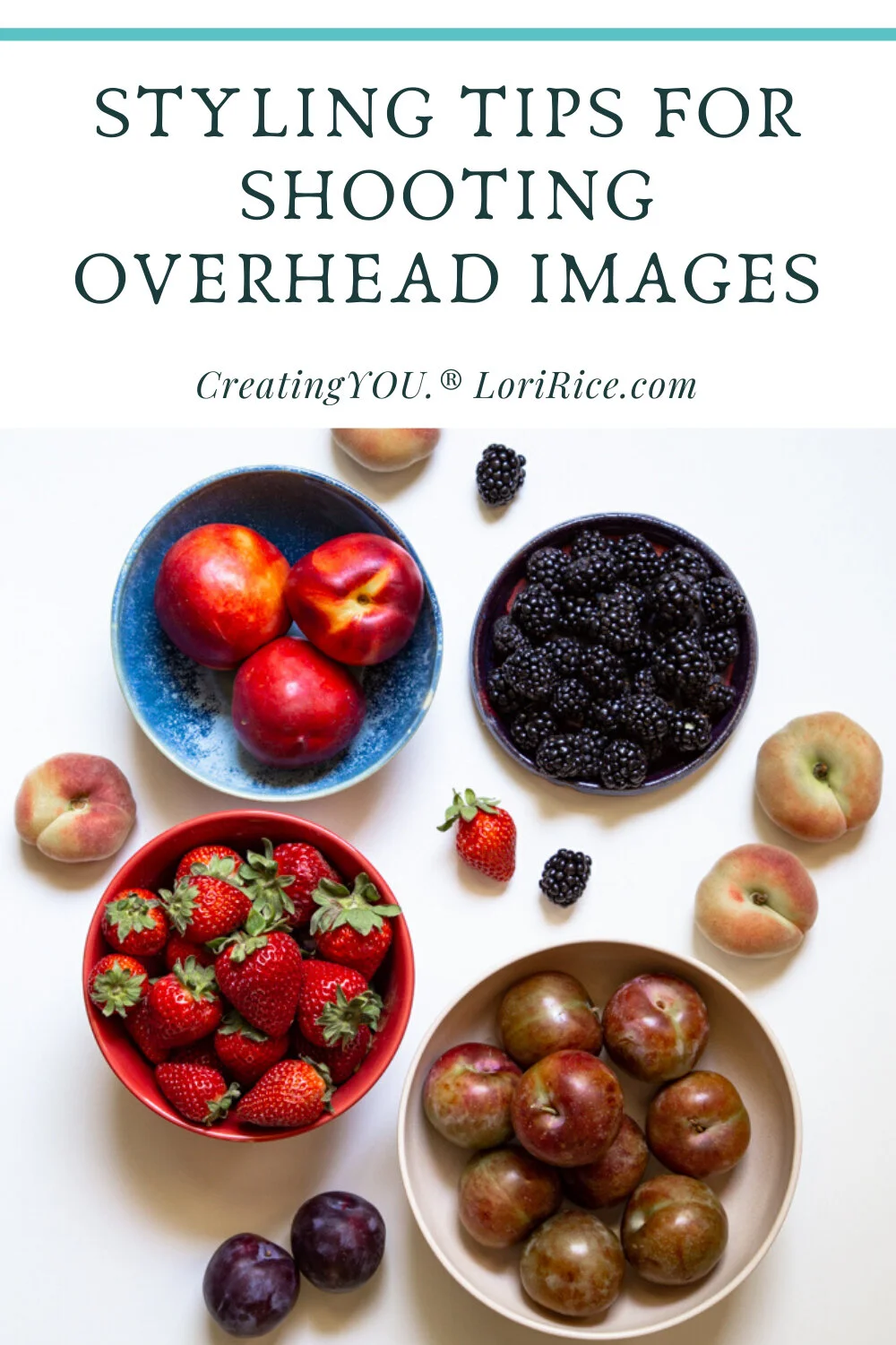
Some foods and products are a perfect fit for overhead shots. But when you look straight down at a big, flat blank canvas you might encounter a few creative blocks that don’t immediately hit you when approaching a set from a 45 degree angle. It can leave you wondering how you should fill all that space.
Keeping my core 5 words in mind, I like to approach overhead photos by answering three main questions.
Where will my directional light enter the image?
Are there multiple heroes or just one?
How can I add interest by maximizing negative space?
Let’s explain how these would be answered with photos.
Directional light? This helps me decide with styling by putting what I want to highlight the most in my image more towards my light source.
How many heroes? Multiple heroes mean I’ll likely have an image with the frame filled with subjects. If there is one hero, I have the choice of keeping it right in the center or following more of a rule of thirds as well as filling the frame or creating negative space for text.
How can I incorporate negative space? Negative space is perfect when you want to add text overlay to an image or simply to add creative interest.
Approaching overheads in this way puts you on a clear path for how you will or should fill the space based on what you are photographing and what you envision for the final image.


